A lot of my architecture friends got all excited this week by the completion of the new Learning Hub of Nanyang Technical University in Singapore by Heatherwick Studio. Quite rightly so! It seems to be an amazing building – made up of twelve stacked towers arranged around a central courtyard, allowing views up, down and across the space.
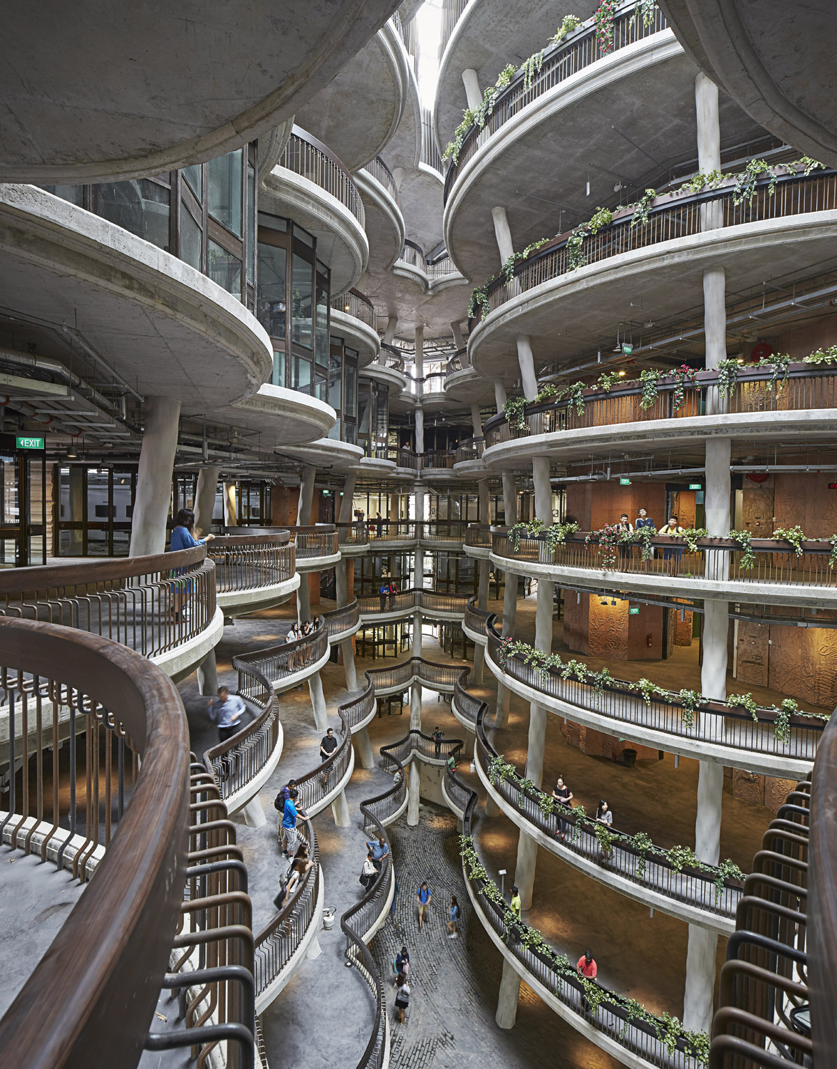
Atrium of the Learning Hub by Heatherwick (Photo credit: Hufton & Crow)
It is not only stunningly beautiful, but also meant to revolutionise teaching and learning. Rather than the traditional rectangular model of hierarchical classrooms arranged alongside a corridor, Heatherwick have created a fluid space to support new teaching and learning philosophies that focus on interactivity, social exchange, small groups and active learning. In their press release they argue:
“With the digital revolution allowing learning to take place almost anywhere, the most important function of this new university building was to be a place where students and professors from various disciplines could meet and interact with one other. The Learning Hub is envisioned to be a place where students might meet their future business partner or someone they would have an amazing idea with. The outcome is a structure that interweaves both social and learning spaces to create a dynamic environment more conducive to casual and incidental interaction between students and professors.”
I do agree that this looks like a fantastic building and – as always- I would love to see it in action to understand how much it actually allows different styles of teaching and learning.
However, what annoys me slightly is how visibility, vistas and views are used synonymously with sociability, interaction and collaboration. Being able to see does not automatically imply being able to meet or being able to interact meaningfully – other than just waving to fellow students across the atrium.
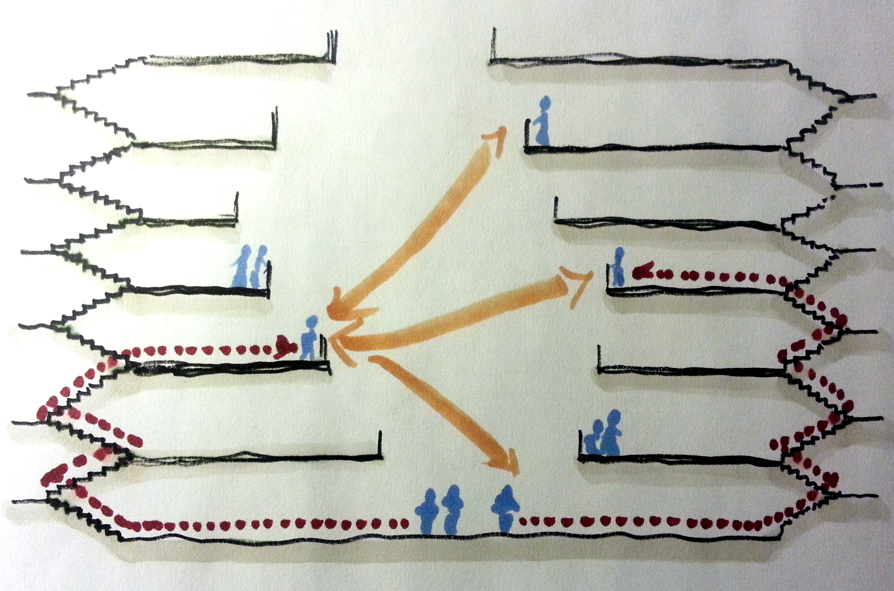
A sketch of the disparity between seeing and going in the Learning Hub
This particular building creates a wide gap between visibility and accessibility for the very reason it is praised as a social building – its generous views. Due to the enhanced abilities to view other people in the atrium – those across the space, but also those on other floors up and down the building, it gives the impression of a porous and fluid social reality. However, meaningful exchange (such as having an amazing idea or plotting the next big business model) requires interaction and collaboration and that means accessibility to people. Actually walking from one place in the building to another is as tedious as it is in other buildings: across the space, down the staircases, through the atrium, up the staircases again.
The disparity between seeing and going becomes even clearer with a spatial analysis of a typical floor plate of the building. I have used the PDF of the forth floor as provided by Heatherwick in their press release pack and modeled both visibility (relationships of seeing) as well as accessibility (relationships of going) with the Space Syntax software Depthmap. In the resulting Visibility Graph Analysis (VGA), all shortest paths from any point in the layout to anywhere else are calculated and overlaid to generate a picture of strategic visibility. Areas with overall shorter paths (more integrated) are represented (as in a heat map) in red, orange and yellow and those with longer paths (more segregated) are shown in green, turquoise and blue.
The first output of the analysis highlights the intrinsic properties of both models – visibility and accessibility – each represented on its own. This is illustrated in images 1 and 2 below. It can be seen that the highest visibility occurs in the centre, in this case the void, where no one is actually present. The accessibility model highlights the circular paths around the void as the areas of highest integration. The outer glass walls of the tutorial and learning spaces are well integrated and mean that people in the circulation spaces have a good awareness of what is going on in the building.
Why do patterns of integration and segregation matter? Space Syntax research has shown that they mirror the potential for space usage and predict (to some degree) patterns of interaction and encounter: it is in the red and most integrated areas that we bump into others most frequently. As such, the building seems to do what it was meant to do.
However, if we put both spatial models on the same, comparable colour range (images 3 and 4), most integration disappears from the accessibility model. This means the visibility model creates a disproportionate amount of connections (it all goes red), and those connections are then cut off since people are not able to go across directly. Instead they have to walk around the void. Or in other words: seeing is favoured, whereas going is disadvantaged. If we were to model the whole building, this disparity would even get more extreme.

Analysis of patterns of visibility and accessibility of the Learning Hub
One of the reasons this effect is so strong in this building is the fact that the atrium cuts out all the areas of highest integration of the visibility model. A void in the centre of a space means longer distances overall, as Bill Hillier has eloquently proven in his ‘Space is the Machine‘ (see page 235ff.) and as I’ve argued using Apple’s new Headquarter building in Cupertino as an example.
Of course the analysis works with all sorts of approximations. True visibility would have to be looked at in a three dimensional model taking the whole building and the very essence of the Learning Hub as multi-level staggered floor plates around a central atrium into account. My colleagues are currently working on such a 3D syntax analysis model and first preliminary results look promising.
So what have we learnt from looking at this building in more detail?
Based on the analysis, I am not suggesting that the Learning Hub is necessarily an unsociable building. It might in fact be the case that the enhanced levels of visibility give students pride for being part of a larger learning community, raise their level of awareness for others and as a result, increase actual interactions and collaborations. Seeing clearly increases awareness, but does awareness always translate to collaborations? At the moment, this is an untested hypothesis and we should start to treat new buildings as exactly this: propositions. Or experiments. But then someone needs to check, whether the experiment was successful at some point later.


Pingback: Collaboration: Too much of a good thing? | The Logical Place
Pingback: Spatial analysis of Heatherwick’s new Learning Hub – Wits' End
Pingback: 'Collaborative Overload' - A Response - Spark Collaboration
Pingback: Serendipity as Strategy - Networkwise